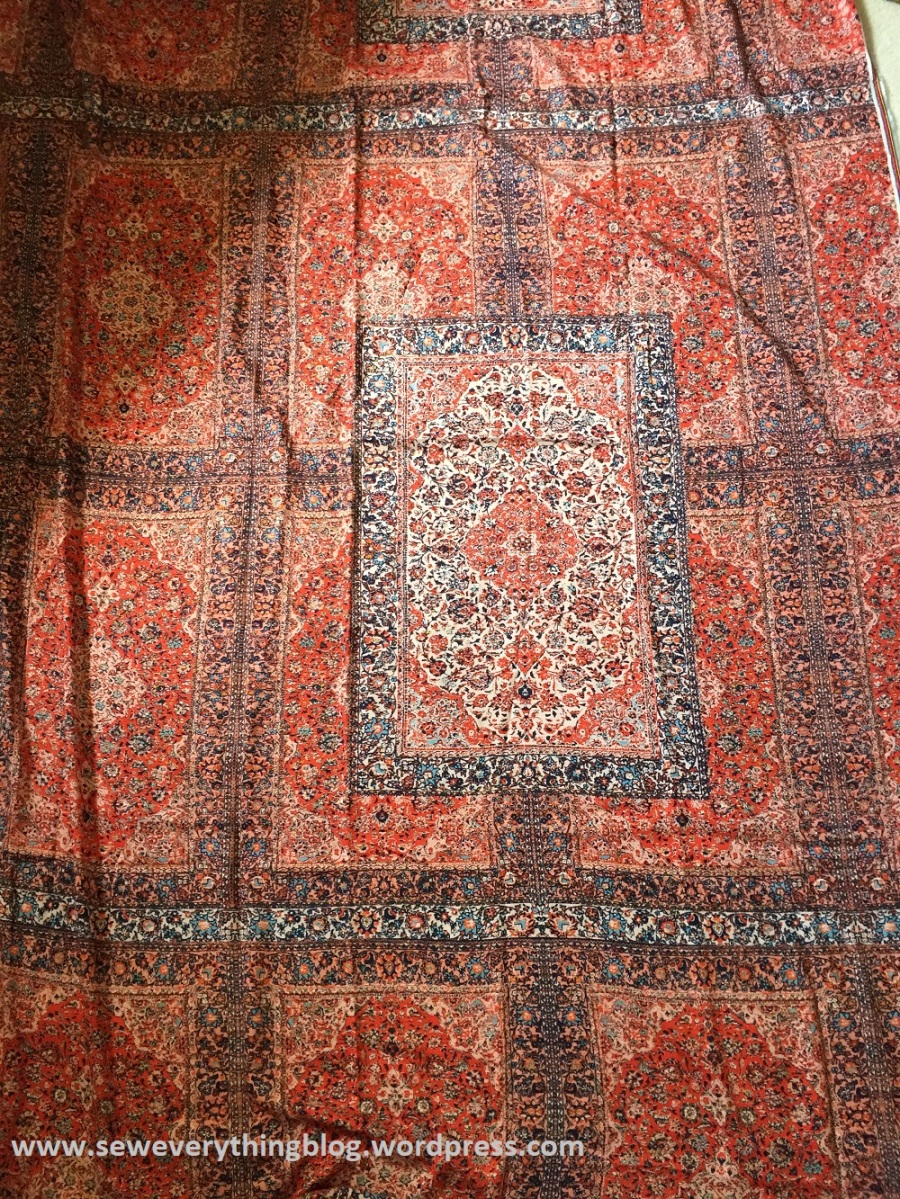
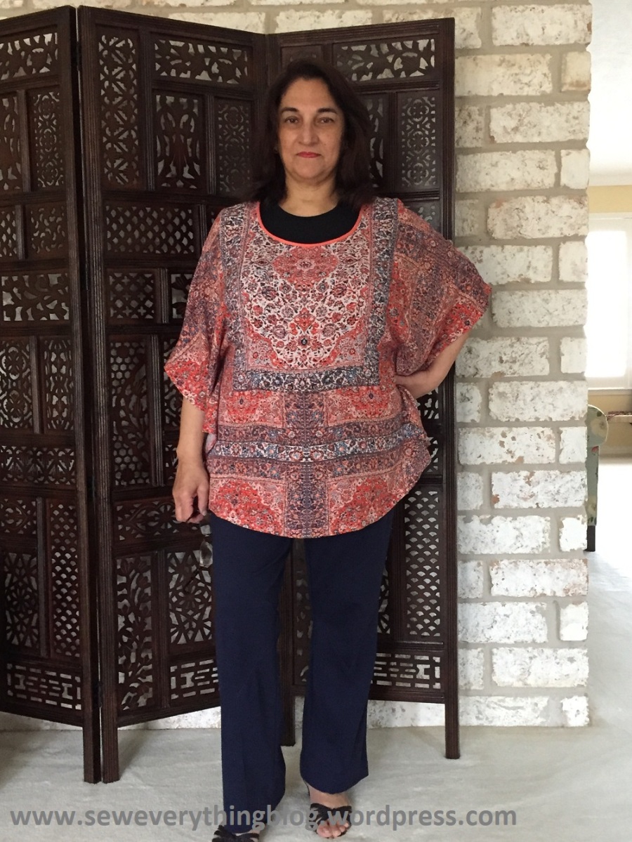
The print looks like an oriental rug store threw up on me, no? I’m making fun of it, but I actually love it! But what drove me to this butterfly style again (McCalls 6510)? It’s the printed rayon challis from Mood Fabrics.

To accommodate the print, I had to make something with as few seams as possible. Let me explain. The most prominent motif in the print is the lighter “rug” with white background; the other rugs sort of move into the background. Ok, good.

The white rug in the repeat is toward the side of the fabric, and not in the center, and I know and totally appreciate what I assume is the textile designer’s reasoning for doing that. You see, when you fold the fabric just enough to make the prominent motif fall in the center front, there’s enough width for the rest of the garment (say, a princess line dress or blouse). If the focal motif (white background) was printed in the center, equidistant from the selvages, you would have to buy more fabric. I think I get it – are you getting my drift, and do you agree with it?
Once I folded the length of fabric to get the white “rug” on the center front, and on the center back, I was good. Except I had to add two very small pieces of fabric at one sleeve end on the front and back. If only it had been printed about 6 inches toward the center, I would have been good — but then I chose this pattern to get the white rug in the center, and in return, had to piece a little bit at the left sleeve a little bit. I don’t think you even notice that.

So easy, peasy and quick. It took longer to press and fold the hem, and to finish the neckline. I have a confession to make about the hem: The edge was serged with an engaged differential feed, pressed up 5/8” and then –- wait a minute — FUSED. I sometimes fuse up hems (usually on knits) before running a stitching line. On this top, I fused it up and then did nothing, sending myself into a state of shock. Yep, I’m a bit of a purist.
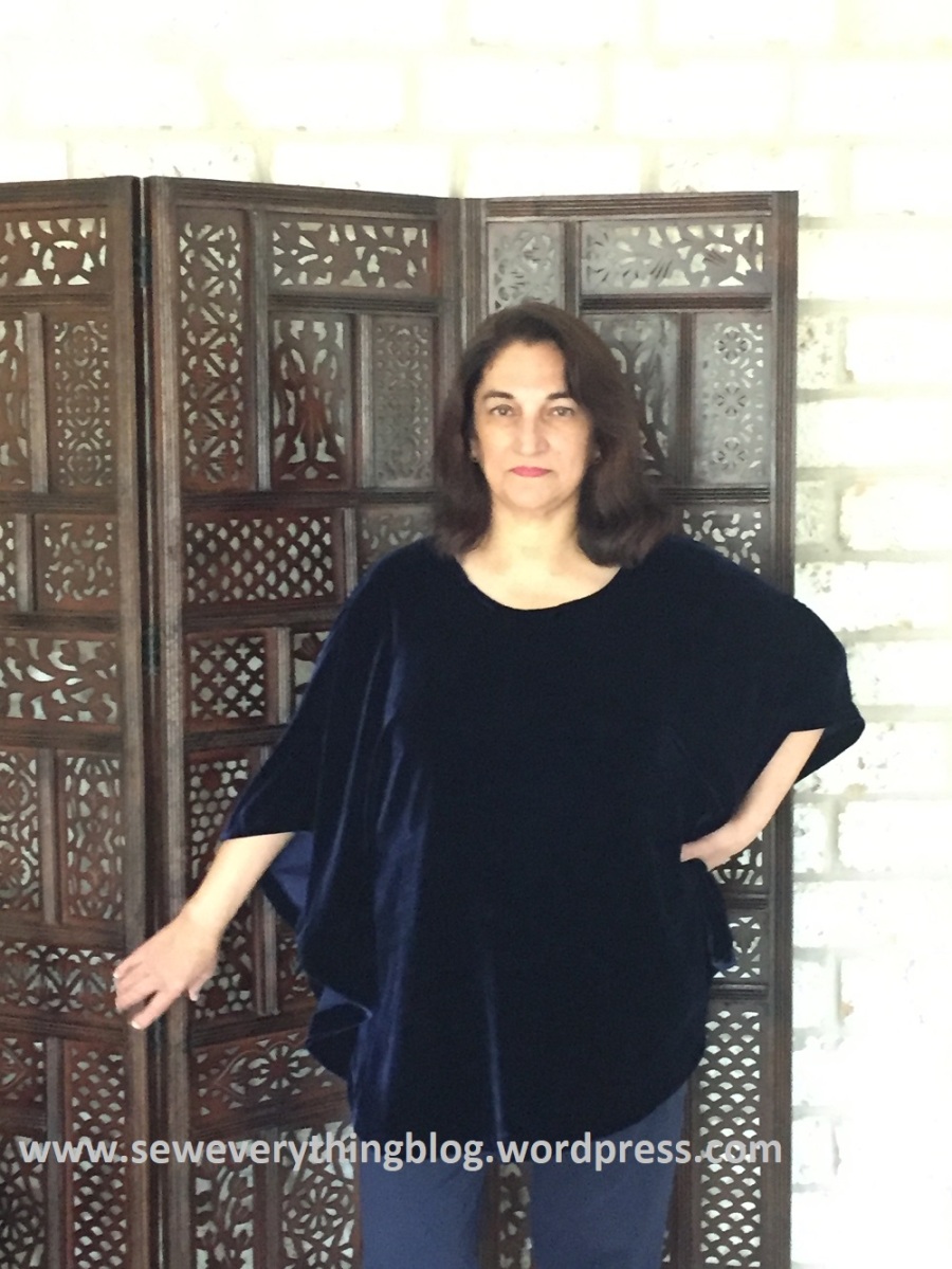
The blue velvet version:


Note: I apologize for the fuzzy iPhone photos. I’ve included pictures of the blue velvet top too. See more about it and a chiffon version of the same pattern here.
I’ve layered the rug print top with a black tee underneath because it just looked better this way; without the black, the print just blended into my skin. Not a good look. Not so the navy velvet — it looks good on its own, but needs to be worn with a camisole because the side seams do not go up to the underarm; therefore, there can be some unintentional peek-a-boo action on the side.
How long does one’s go-to outfit last before one gets tired of wearing it? I hope I find another uniform to wear soon when this wears out – there’s so much pretty fashion to sew out there. Also, I need to keep up with my sewing plans for 2018, listed in a past post.
I’ve noticed an uptick in blog followers lately. Thank you all!
Samina

This top looks wonderful & the colors are great on you.
I don’t think anyone will see your little addition unless you point it out.
LikeLike
That looks amazing!
LikeLike
The pattern is perfect! I would have passed that fabric up! Beautiful! And the Velvet looks so rich! I don’t think I’d ever tire of wearing that! ;o)
LikeLike
The velvet is so glamorous and you look lovely in it! That said, I think you might end up wearing the rug print top even more. You nailed the pattern placement, and it flows beautifully.
LikeLike
Great pattern placement – well worth the extra time used.
LikeLike
That happens to me to sometimes Samina…the fabric tells me what pattern to use. I love both versions on you!
LikeLike